


Don’t Tell Us What To Think About Art
How much is too much? And why does the latest exhibition at the Bluecoat leave David Lloyd angry and more than a little confused? It's the latest example of arts organisations telling us what it all means...
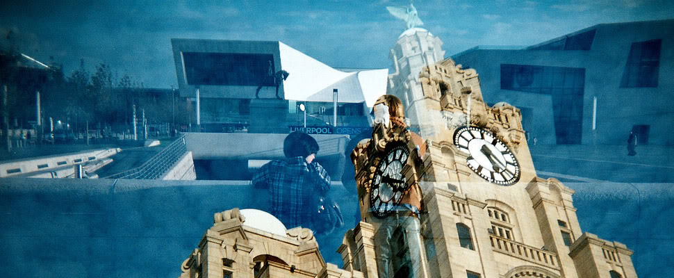
 There are two exhibitions running at the Bluecoat right now. And they’re both called Niet Normaal.
There’s the one I’m seeing, feeling and responding to. And there’s the one spelled out on the interpretation boards. The one telling me I’ve got it all wrong.
I’m standing by a jumble of wooden posts, and gaudily painted slogans. I’m standing right next to it. And it looks and feels like one of those old house clearance shops you get in Kirkdale - the piled up detritus of a life extinguished. A funeral pyre.
But no, the interpretation board chides me “‘Bonfire’ resembles something between a demonstration and a building site”.
Really? Who says?
And, more to the point, why say anything at all?
Why the need for subtitles - art isn’t in a foreign language is it? Isn’t its interpretation our job? Take that away and what’s the point in my even being here?
“Nobody is wrong, everyone is right,” says Tate Liverpool’s summer artists in-residence Kerry Morrison, “But to tell someone what it is they’re seeing? That’s wrong.”
But don’t misunderstand me, the exhibition, part of the ongoing DaDa Fest is affecting and keenly curated - a mutated version of an original show in Amsterdam, the event forms part of the London 2012 Festival programme.
Karin Sandler’s shaker maker-esque 3D inkjet models taken from actual bodyscans are breathtaking - a mini roll call of Dutch exhibition-goers, in all states of dress, undress, age and health, arranged on metal racks like Lilliputians in a Star Wars cantina. Here, there is nothing more to be said.
But, again, the interpretation board is determined to spell out what it is we’re actually seeing. In front of us. It’s if we’re sitting at home listening to Front Row.
‘What is the norm, and who decides?’ asks the event. Well, it would seem, the interpretation boards are going to have a pretty good stab at it.
It is, sadly, another example of the growing phenomena of art galleries desperate to unpack the tricky stuff for us, to break it down and spoon feed the answers.
Why the show’s original curators feel compelled to do this, when the Playhouse manages to get by without surtitling Hamlet with placards saying ‘he’s really fed up now, his uncle’s shagging his mum’ baffles me.
“You don’t get this in museums - they tell you dates, materials, facts. Well meaning curators think it’s opening the art up - it’s not, it’s closing it. If you think you’ve misinterpreted something it alienates you,” Morrison says.
I move on to the main gallery - a vast glass-topped display case is crammed with a colourful array of blister-encased pills - the lifetime medical regime for a single patient.
“This allows for discussions to emerge around the growing culture of dependency on medication” - the board says.
Does it? Or does it make you wonder at how pharmacology is finding ever more miraculous ways to keep cancers and life-shortening illnesses at bay? There’s something about that phrase ‘culture of dependency’ that, to my mind (and as ex carer for someone with a terminal illness) rankles. Try telling someone on anti rejection drugs, or chemotherapy, they’re part of a dependency culture. Does it sound a bit too close to benefit culture? But, again, maybe I’ve misinterpreted the boards.
So why are they here, if not to frustrate and castigate, to manipulate your reaction in such a way that you comply? How ironic that an exhibition subtitled ‘Difference on Display’ should be so fixated on a zero/sum response. A gallery filled with glinting strips of pills is powerful enough for you to join the dots, isn’t it?
“My motto is most definitely show, not tell,” says Bluecoat Exhibitions Curator, Sara-Jayne Parsons “But be ready to help interpret, as opposed to ‘tell’, through opportunities such as exhibition tours, artist talks or accompanying pieces of print, reading areas or digital sources. It’s not my job or the responsibility of the gallery, or the artist’s, to tell viewers how to respond. Meaning is your own.”
“For some shows it doesn’t make sense to have any writing. It becomes intrusive to the visual experience, so any guides or accompanying catalogues can give you enough text but don’t need to be on the wall.”
I’d say Niet Normaal is one of those shows. But it singularly refuses to let that happen, and is the weaker for it.
A grainy looped film of a patient with neurological illness hopelessly trying, and failing, trying and failing to stand is accompanied with the cool text: “the artist moves our thoughts from a perverse voyeurism to a more neutral, respectful observation of the human body.”
Maybe your thoughts, curators. For me, it was anything but neutral. It was the saddest, most moving piece in the whole show. Perverse voyeurism never even crossed my mind. Until you said it.
“In many galleries interpretation panels go too far,” says Laura Robertson, who, before running the Double Negative website, oversaw the respected Royal Standard Studios (and who’s recently co-curated a show at the Victoria Gallery).
“I always go with less is more, I prefer not to use many text panels or labels if I can help it. A separate gallery plan does this job without being too distracting. I don’t think you ever, as a visitor or a curator, want educational content to overshadow the exhibition itself. You want an exhibition that is open to discussion and interpretation - otherwise where’s the fun?
Robertson singles out the Tate’s Turner Monet Twombly a good example of a minimal approach to interpretation - the curator Jeremy Lewison preferring for visitors to make their own minds up.
“If you wanted to hear more about the artists and how they worked, you can watch a film of him being interviewed on the fourth floor,” she adds.
As Parsons is keen to point out, some of the Bluecoat’s touring exhibitions come complete with interpretation text panels already drafted. And it’s true that some artists have very particular feelings on the matter.
My feelings on the matter? Well, if anyone’s interested, I’d like to rip up the interpretation panels, pile them into a pyramid and make them resemble something like a bonfire. In fact, no, I’d actually set fire to the lot of them.
Niet Normaal: Difference on Display
The Bluecoat, to 2 September, Free


Ummm. I think you might be shooting the messenger here Dave? The culture of over interpretation more often comes from funders than from galleries themselves.
I’ve not spent any time with the show, so don’t know how the panels are phrased. But I do think that so called ‘disability arts’ is involved in a particular struggle at the moment about finding its own language. This show might be a misguided attempt to find the right balance between inclusiveness and reaching a space of ‘artistic legitimacy’ (whatever that might mean).
yeah, I did say that the show came with pre-written panels, and was careful to ask Bluecoat for its policy. But as ‘messenger’ doesn’t Bluecoat (or any gallery) have a responsibility too? Surely if they disapproved of how a piece is described, within its jurisdiction, it’s a conversation they must have, as to how it finds a way to keep external and internal curation on the same page? I guess it’s the question of what is the Bluecoat - a space for hire, or a gallery with its own methodologies? I don’t see this as a disability arts issue exclusively, to be honest. Have examples of other shows where interpretation crosses the line into explanation.
Chill out dude. Interpretation is needed for certain audiences not as articulate as you.
I do think it might be a disability arts issue, or that disability arts is a particular catalyst for this type of problem. Given my understanding of the Bluecoat’s relationship with DaDa Fest (who curated the show) it is most likely that a disability arts specialist wrote the text panels. As an Arts Council assessor I have gone to a number of shows where I have also encountered a kind of tension between the quest to engage in arts language and the need to be inclusive for a disabled audience who may not be arts specialists. Watching this process of ‘finding a voice’ is one of the things that makes art about disability very exciting to me at this time.
Your point about the Bluecoat being ‘space for hire’ is of course a good one. I completely agree! But trying to tackle such a systemic problem through an argument about the text panels in the gallery is not, in my view, going to get us very far.
I love the panels in art galleries like the Walker that tell me about the painter, his or her situation at the time they were painting this, what they may have been trying to paint, and perhaps a guess at the painting’s nuances, inspirations and sometimes hidden messages contextual to the time of painting.
What I don’t like is exactly what is spoken about in this article: being told what it “is” and what it’s “meant to mean”.
Ultimately, if it’s modern interpretive art then the message is in the eye of the beholder surely?
Else, if an artist is aiming for a single interpretation essential to convey the singular meaning they are aiming for, and the work fails to achieve this without the presence of a message panel, then what is there to say other than to judge the corresponding work accordingly?
I run a disability arts project in Somerset and always come to DaDa Fest, it’s something Liverpool does extremely well. I too saw this exhibition and wondered about the varacity of these boards too. I wondered whether they were written for a guided partially sighted person (couldn’t see Braille boards) but even then I think they overstepped the mark and strayed too far into imposed interpretation. I wonder whether it was a translation issue, if they came from Amsterdam? Vanessa is right about the complexities the disability arts world is wrestling with, but this exhibition is an example of how not to do it, I fear. Disabled people are more than capable of responding to the world around them in the same way other audiences can. More-so, I often find.
Dada-ism has wonderful ideas but the end form usually falls short in the communication (my opinion) and many in the art world are hooked on the beauty of the “idea”. They “love” the idea of ideas and think that it is their duty to ram these ideas down our throats.
True some help is welcome to those who are trying to educate themselves about art but the education they need is that which teaches them to let go of their mind when viewing art and develop an array of perceptions which coupled with their imagination will lead them to growth. Provided that the work does not represent a stupid idea in the first place.
The lack of this form of education is criminal, it could make people altogether more creative in their approach to living and benefit all.
I haven’t seen this exhibition but I am usually entertained by Dada so I may well pop along, and try not to read anything
Bryn: just to clarify, this piece is about an exhibition from DaDaFest - the annual disability arts festival, rather than a Dadaism exhibition. Either way, it’s definitely worth checking out.
Just as well you told me, I may have been disappointed upon arrival, hahaha.
How did they come up with a name with “Dada” in it but it has nowt to do with Dada-ism? oh well I’m sure it has a good story behind it.
I don’t really see this as disability arts-specific. The Tate used to overdo the curation at its exhibitions years ago and the same can be seen from time to time elsewhere.
Bryn - DaDa is “Disability and Deaf Arts”.
As for the issue of gallery labels - no one forces anyone to read them. I quite often find that the ideas I take away from a piece are quite different from what it says on the label, but I don’t see any reason to get angry about it.
I completely agree that art should speak for itself, without explanation. Viewers should be able to develop their own response to works on display, but once they’ve done so, what’s wrong with seeing what someone else has to say about it? Doesn’t this just provide another viewpoint and provoke further thought/discussion? After all there’s no right or wrong in this situation.
Perhaps it would be better to view gallery labels as suggestions or possible interpretations rather than “this is what this work is about.”
It’s easy to forget that not everyone who visits a gallery is used to engaging with/thinking about art. I’ve got friends who’ve said they don’t really know what to “do” in a gallery, they’re almost scared of spending more than a couple of seconds looking at something. For those people, gallery labels can be a really useful “way in” to art. They give people a starting point and allow them to spend a bit more time with an exhibition, hopefully have a more fulfilling experience and come back to visit the gallery again - then perhaps they can learn to develop their own responses to work, and become the David LLoyds of the future…. :p
you had me til the last line (d)
(d)